Web Design Tips For A Minimalist Website
The field of web design is constantly evolving. There is a lot of rivalry for resources. Therefore, it has to change to give people a fighting chance. Did you realize that every minute, 380 new websites are launched!
That is how movements begin, which is beneficial in fields like design. You need a streamlined website right now. Where do you even start? Read on since we will soon be offering some helpful advice.
So why is Minimalism so popular?
Sometimes conflated with simplicity, minimalism pares things down to their barest necessities. This indicates that although basic shapes may be associated with minimalism, this is not always true.
Minimalism is a design philosophy that eliminates extraneous details in favor of a more straightforward presentation of the central idea. The minimalist aesthetic has spread across the design world as its advocates see the value in using less to say more.
Minimalism has established itself, and rightfully so, across various artistic disciplines, from painting and sculpture to digital product design and web design. Digital goods and online methods that adhere to the minimalist aesthetic are no less impressive because of it. Apple is one of the most outstanding examples of a business that keeps minimalism in mind while creating its goods.
Unsurprisingly, many companies like minimalist web design since it helps them increase their revenue, as it is aesthetically pleasing and easy to use.
Web Design Tips For A Minimalist Website
1. Avoid cramming
The design term for the space between pieces is “whitespace” or “negative space.” Using whitespace has several positive effects, but the most important is that it enhances the user experience and draws more focus to the information and the product on your page.
White space is used to create harmony in a layout.
 2. Pare down to the essentials
Pop-ups, auto-plays, advertising, and animated GIFs on a website are all distractions that drive away potential customers. To implement a minimalist website design, one should use the bare minimum of page elements such as media (complex animations, stock images, extensive content, etc.) and text. This will encourage site visitors to read your material and execute the necessary actions.
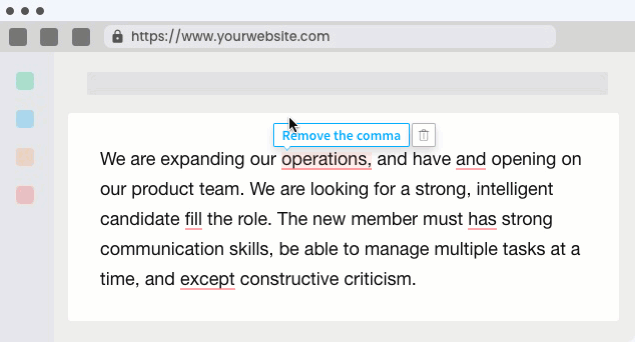
3. Check the spelling and grammar
The information on your website will be more noticeable now that you’ve removed distractions, but you should still give it your all to make it seem reasonable. Good minimalist websites use only one typeface for the text. Fonts like “comic sans” and “handwriting” are acceptable options. Maintaining consistent typography across the site is also strongly suggested.
4. Make use of vivid hues
Although working with vibrant hues may be a lot of fun, it can be challenging to do so while using a minimalist aesthetic. Backgrounds with plenty of colours are more likely to catch the eye of the user. Yet, if there is an excessive amount of colour, the backdrop ceases to be exciting and instead becomes annoying.
Use black or white font to set off your bright colours, and you’ll have an excellent, eye-catching end result like the ones seen above and below. If possible, avoid unusual typefaces, rapid transitions between content blocks, and elaborate animations.
5. Use fancy fonts
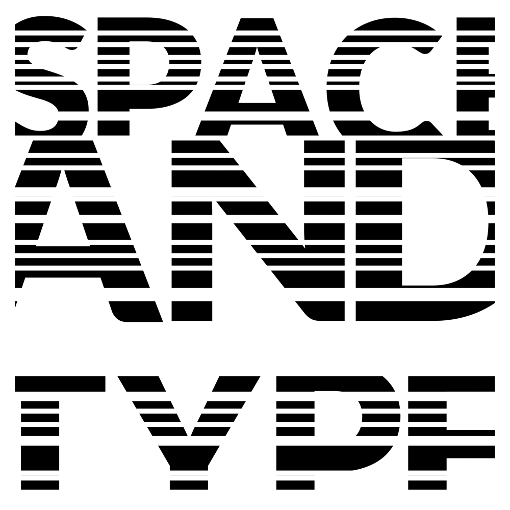
You are accessible to as creative as you want here; make sure the typeface is legible and attention-grabbing. Good typography may compensate for the lack of images and animations if you are going for a minimalist look on your website. Visitors will quickly learn what is most essential to you and how to navigate your site, thanks to the fonts you choose.
Remember that the readability of your product will be affected by how fonts appear on mobile displays. Statista reports that between 2009 and 2017, over half of all websites were built with mobile in mind. This pattern is expected to persist due to the proliferation of mobile devices available today.
Not only that but in 2018, Google will unveil its new Mobile First Index, which will prioritize mobile-optimized sites in search results.
6. Improve the usability of your primary website by using grids
Another approach that uses grids to increase usefulness without sacrificing simplicity is to use gradients. Websites benefit significantly from the organization and structure that grids provide. Organizing your website’s parts into a grid makes them more legible. A grid provides the appropriate spatial connections and brings harmony to a design that initially seems less minimal.
7. Improve your user experience by adding navigation bars.
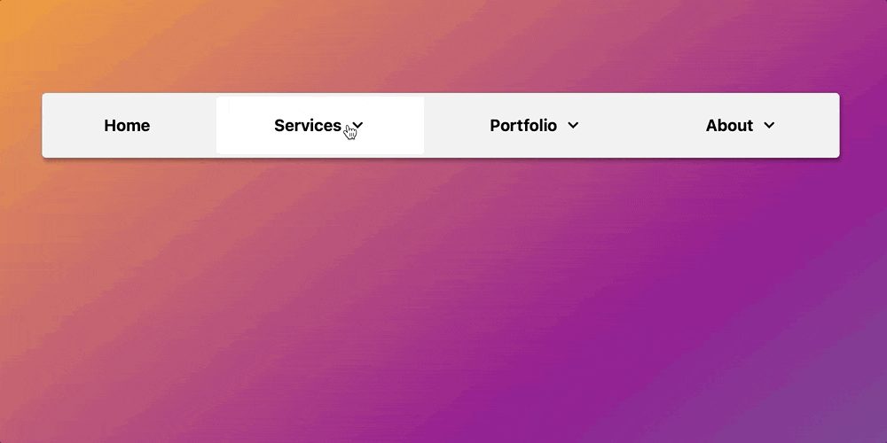
In terms of minimalist design, a website’s navigation is a crucial component that significantly impacts the final product. You may always fall back on the standard menu bar without room to implement user-friendly grids.
8. Clarify your call to action
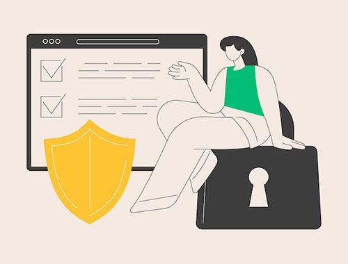
Website call-to-actions should be visible within three seconds or less. You can only expect them to return to the site where the CTA is hidden and make a purchase. You need to include the CTA buttons on your website so that people can easily recognise your brand and do the activities you want them to do without difficulty. Web designers may assist novice website designers in making compelling CALL TO ACTION buttons and placing them in strategic locations.
9. Visually elucidate written page content
Photos are frequently more helpful than hundreds of words when explaining how to use a website’s features or providing directions for using the site’s services. All the hallmarks of minimalist visual design must be present in the final image, so keep that in mind while you browse. Consider using a high-definition image with plenty of blank, white space, such as a room without furniture.
10. Establish a Nav Bar
The key to achieving a minimalist feel is to eliminate any unnecessary elements. Still, designers occasionally go too far by removing things like most of a website’s navigation buttons. Although it makes sense to eradicate new features, you shouldn’t bury vital tools and resources for your users.
We recommend keeping the Menu button and placing the other tabs and menus inside. It is possible to conceal the homepage button inside the company’s logo. Controls should also be illuminated when the mouse is over them to let the user know they may be clicked.
Conclusion
Whether you’re just starting out or have been around for a while, redesigning your website with a minimalist aesthetic is a good idea. A minimalist website is a terrific method to provide your visitors and clients with a better experience, and it also remains in style forever.