Responsive or Adaptive Website Design: The Right Choice
If a website is the face of your business, website design is the heart. Website Design determines the smooth functioning of the website. Everything depends on the standard of the website design, whether it is the color, the layout, or the orientation of the website. Today your website is a very crucial part of your business because most of your target consumers connect with you through your website only. So, your website should be smooth and user-friendly. It must cater to their needs perfectly. All the elements within the website should work without any glitches. This is the beauty of a great website design. It provides the user with an exhilarating user experience. What’s more, it helps to fulfill the objective without any hassles.
The Importance of New Web Designing Techniques
In modern times, people not only work on desktops and laptops but also with mobiles and tablets. In fact, they are more friendly and habitual with mobiles than their old friend, desktops. Needless to say, it has become crucial for website owners to design a website that looks great and works superbly across all types of devices irrespective of screen sizes. For if you cannot fulfill the needs of the consumers, you could be down and out.
Not only this, a specific website should look its best on all types of browsers as well be it Chrome, Mozilla or Safari etc. It is a challenge having many aspects to it. However, website designers have come up with two cutting edge strategies to tackle this issue and make the users happy. The Responsive and Adaptive design strategy.
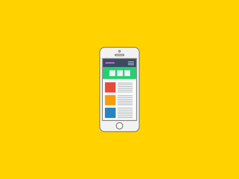
 The Responsive Web Design: The Approach
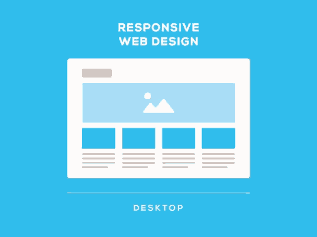
Responsive and Adaptive Web Design are two different approaches having one single goal – to make the website work on all types of devices and browsers without any problem. A Responsive web design is an approach whereby a website designer designs one website that smartly adapts to a range of screen sizes. So whether you open it on a desktop or a mobile, it provides you with silky smooth navigation. It becomes possible with the CSS Media Queries (A customized sheet) technique that is used in web design. This technique analyzes the elements of the user’s device, and the website performs accordingly.
Dropbox is a fine example of a responsive design. The website is as easy to navigate on the Computer as on the mobile. The desktop version looks elegant, while the image colors blend beautifully with the grid. For the mobile version, they have improvised the grid colors and the font colors a bit to keep the readability intact.
The Responsive web design approach was devised in 2010 when renowned web designer Ethan Marcotte presented it at an event in Seattle, USA. Since that time, this technique has proved beneficial for business owners, as with their website working well on the Smartphone, they can reach out to more consumers. It is also easy for consumers as they do not have to put on their laptop or desktop every time to access a website. They can pick up their phone, anywhere and connect with the website.
The Adaptive Web Design: The Approach
Adaptive web design is another way of website design. In this method, the designer creates a website based on the particular device. This approach aims to design a website whereby the user can access a website without any technical limitations. So whether the user has a mobile or a laptop, he can browse the website freely and smoothly. In addition, the consumer does not have to wait for the site to open.
The designer creates the website using progressive enhancement and graceful degradation strategies. The use of different designs for different screen widths enhances the user experience. The first step is creating stunning websites to suit modern browsers, and the second step is to make them appropriate for old browsers.
Apple is one website to be a flag bearer of adaptive design. It has a customized design for every type of screen. The content is specifically suited for the detected screen. The page format is similar to that of the desktop. But the content is different based on the screen size. Images are also changed to enhance the experience.
The author Aaron Gustafson introduced this approach in his book, Adaptive Web Design: Crafting Rich Experience with Progressive Enhancement. The business owners wanted to increase their business, so they gave preference to this design.
Responsive Web Design or Adaptive: The Better Choice
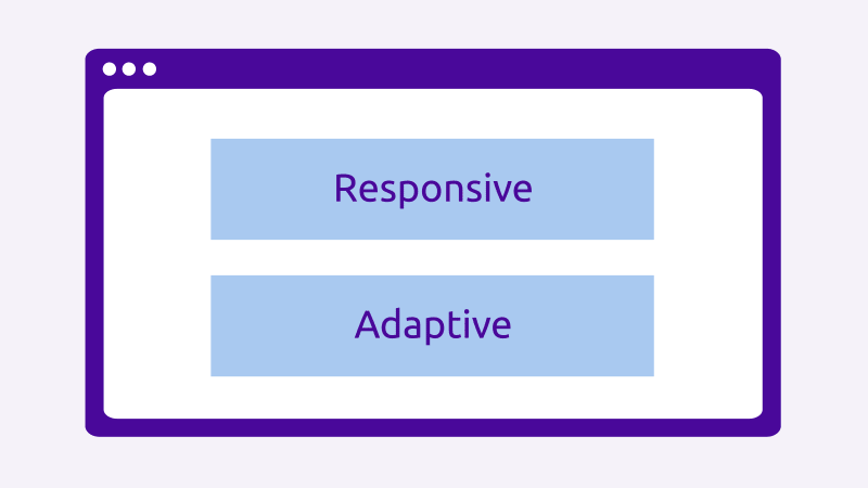
Some questions do not have an exact answer. Both are powerful techniques for creating stunning website. When it comes to a mobile website, you cannot pinpoint any specific technique that is correct. You can choose the technique according to your needs and resources. However, both the techniques have their own Merits and Demerits:
The Merits are demerits of the Responsive Approach are:
Merits:
- A Fluid Navigation experience across all browsers and devices
- Consistent Experience on New Devices (without standard dimensions)
Demerits:
- Less Controlled Display of the website of Different Devices
- Technical Restrictions if the Website flows on incorrect size
- Web Designer should be expert in Responsive Designing
- Hampers Perfect Performance as delays loading
The Merits are Demerits of the Adaptive Approach are:
Merits
- Creates an Exclusive Website for each device and browser.
- Enhances Performance as it is created for specific screen size.
- Easy for Advertisement Content.
Demerits
Risk of having negative effect on SEO if content fails to work on all platforms.
Conclusion
Responsive and Adaptive techniques are perfect innovations in the field of web designing. Still, you need to understand your requirements to use them to perfection. So make a dynamic website and let your business reach the skies of success.
