Key Dynamics of Branding and Logo Design
A logo is a graphic entity that encapsulates the brand identity within itself. A logo tells the audience what the brand stands for and a good logo helps the brand to stand out of the huge market clutter leading to rapid growth.
A brand logo serves as the first impression of a brand upon its consumers. So, to boost brand image it is necessary to have an attractive brand logo.
Simplicity
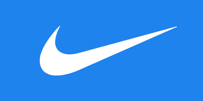
The most important trait of any logo is simplicity. Human mind can grasp simple things easily and it repels complex graphics because of the labour of thinking needed to be performed while understanding complex structures. Also, a logo should not be as simple as boring, it should be intriguing Hence it is the main reason why the giant brands like Nike, Puma and Adidas etc. have always kept their logo simple and attractive.
Identity
Since the dawn of branding, the logo occupies its position on every product and service of the brand and so it should encapsulate the identity of the brand. A logo should point out what the brand stands for. Here an important point is that a logo is for boosting brand recognition in the target market. it should not focus much on brand communication because it can be done through other marketing mediums like social media, content marketing etc.
Standing Out of the Clutter

Human brain picks out distinctive patterns more quickly. A logo should be unique and that way it will be able to stand out of the huge market space where similar logos can create confusion among the consumers bringing down the rate of brand recognition.
The Golden Ratio
![]()
The golden ratio also denoted by the Greek letter phi is found to be the most pleasing. Brands like Apple, Pepsi, Toyota have used the golden ratio in their respective logos making them more attractive and pleasing to the human mind. The logos designed using the golden ratio are versatile. They look great in every colour and size given the proportions should be maintained properly.
Timeless
Everything that is not timeless fades away with time and if the logo fades the brand will also be fading away with time. Every great logo sustains through the changing time and maintains brand recognition in the target market. The brands which keep on changing their logos with time suffer a huge loss of brand identity as the new logo takes time to register itself in the minds of the target audience.