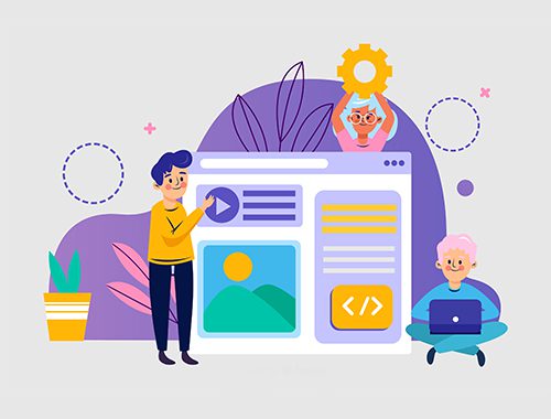
What is Responsive Web Design?
Have you ever visited a website on your phone and found it hard to read or use? Responsive web design solves this problem. It changes the site’s layout based on your screen size, making websites easy to use on any device.
Keep reading to learn how a web design company can help.
Understanding Web Design vs Web Development
Web design focuses on how a website looks. It deals with colours, fonts, images, and layout. Web development is about how the website works behind the scenes. It uses coding languages like HTML and CSS to create functions and features.
Web Design: The visual aspect of a website
Web design focuses on how a website looks. It includes elements like colours, fonts, images, and layouts. The goal is to create an attractive and user-friendly website. Good web design makes it easier for users to find information.
A visually appealing site keeps visitors engaged.
Responsive web design plays a key role in this process. It uses HTML and CSS to adapt the look of a website based on screen size. This ensures that the site is mobile-friendly and looks good on all devices.
Users enjoy seamless navigation whether they use a phone or computer.
Web Development: The technical aspect of building a website
Web development is important for creating a website. It focuses on the technical part of building and maintaining sites. This work uses HTML and CSS to ensure pages look good on all devices.
Developers use these languages to resize, hide, or adjust content based on screen size. Responsive web design helps in this process by allowing websites to adapt seamlessly to different screens.
Responsive web design takes into account user behaviour and device compatibility. It uses flexible layouts that can scale according to screen size. Media queries are also key in this process.
They apply different styles based on the type of device being used. Many developers turn to frameworks like Bootstrap for support in building responsive sites quickly and effectively.
The Importance of Responsive Web Design
Responsive web design is key for today’s websites. It helps users enjoy a smooth experience on any device, whether it’s a phone or a tablet.
Creates a seamless user experience across all devices
A seamless user experience is key for websites today. Responsive web design ensures that a site looks good on all devices, big or small. It adapts layouts based on screen size and orientation.
This flexibility enhances usability and makes browsing easier.
Users often switch between phones, tablets, and computers. With responsive design, the website adjusts automatically for each device. This means no need to zoom in or scroll sideways to read content clearly.
A fluid grid system helps keep everything organised and neat across different screens. Effective design improves user satisfaction and helps retain visitors longer on the site.
Improves website usability
Responsive web design greatly improves website usability. It ensures that a site looks good on phones, tablets, and desktops. This adaptability helps users easily find what they need.
Visitors enjoy a better experience when they can access a mobile-friendly design. Responsive web design uses flexible layouts to adjust to different window sizes.
Fluid web design allows images and text to fit various screens without problems. Users do not have to zoom in or scroll sideways to read content. With responsive techniques like media queries, websites change style based on screen size.
This leads to higher engagement and satisfaction among users. A user-centred approach makes the browsing easy and enjoyable for everyone across devices.
Boosts search engine rankings
Responsive web design boosts search engine rankings. Websites that adapt well to different devices tend to rank higher in search results. Search engines prefer user-friendly websites.
They want visitors to have a good experience, regardless of the device used.
Responsive sites use HTML and CSS effectively. This allows them to resize and adjust based on screen size. Techniques like fluid grids and media queries help achieve this flexibility.
A mobile-friendly web design ensures content is easy to read and navigate on any device. Better usability leads to longer visits, which can improve search visibility over time.
How Does Responsive Web Design Work?
Responsive web design works using a flexible grid layout. This helps the website fit different screen sizes easily. It also uses media queries to change how the site looks on various devices.
Lastly, images and text adjust smoothly to match the size of each screen.

Uses a flexible grid layout to adapt to different screen sizes
A flexible grid layout helps websites adapt to different screen sizes. It uses fluid proportion-based grids. This means areas of the website can change size based on the device being used.
For example, a mobile phone will display content in one way, while a tablet may show it differently.
This type of design employs CSS3 techniques to create these adaptable layouts. The goal is to provide users with a good experience, no matter what device they use. Responsive web design makes sure that websites look great and function well on all devices with varying screen sizes.
Incorporates media queries to adjust website design for different devices
Media queries play a key role in responsive web design. They help adjust the website’s look based on screen size and device type. This means your site will look good on both phones and tablets.
Web developers use media queries to apply different styles for various devices.
Using flexible layouts, websites can change their appearance easily. For instance, text size may shrink or images can resize to fit smaller screens. Techniques like fluid proportion-based grids help create a seamless user experience across all devices.
This adaptation ensures users have a pleasant time browsing, whether they are using a smartphone or desktop computer.
Utilises flexible images and text to fit different screen sizes
Responsive web design uses flexible images and text to fit different screen sizes. This approach helps websites look good on any device, whether a phone or a computer. It allows images to resize without losing quality.
Text also adjusts so it remains easy to read.
CSS3 techniques make this possible. They help create fluid layouts that change based on the viewer’s screen size. By using these methods, developers ensure that users enjoy a better experience on all devices.
A mobile-friendly website is one that adapts well and keeps visitors engaged across various platforms.
Benefits of Responsive Web Design
Responsive web design offers a better user experience and helps websites reach more people. This approach ensures that your site works well on all devices, making it easier for users to navigate.
Higher conversion rates are one of its key advantages as it attracts and retains visitors effectively. Discover how responsive design can elevate your website’s success!
Better user experience
A better user experience comes from using responsive web design. This design adjusts well to different devices like phones, tablets, and computers. It makes websites look good on any screen size.
Users can easily read content and interact with sites without problems.
Using flexible layouts helps in scaling website content automatically to fit the screen. Media queries apply different styles based on the device being used. A fluid web design ensures that images and text adapt smoothly to various sizes.
Good designs lead to happier users who spend more time on a site, boosting conversion rates significantly. First-hand experience shows that visitors prefer mobile-friendly designs when browsing online.
Higher conversion rates
Responsive web design boosts conversion rates. By ensuring websites look good on all devices, it makes it easier for users to navigate. Users have a better experience when they can find what they need quickly.
A mobile-friendly web design meets the needs of visitors no matter their device.
Websites designed with flexibility in mind attract more visitors. This leads to higher chances of customers making purchases or signing up for services. Studies show that responsive designs are cost-effective and help improve user experience.
With scalable web design, businesses can reach a wider audience, resulting in increased sales and engagement.
Cost-effective solution for reaching a wider audience
Responsive web design is a cost-effective solution for reaching a wider audience. It allows websites to adapt to different devices and screen sizes without needing separate sites. This saves both time and money in development.
By using flexible layouts, responsive design ensures that all users have a good experience on any device they choose. Websites that follow this approach can improve their search engine rankings too.
A better ranking means more visibility, leading to more visitors and potential customers.