How To Optimise Your Website Footer For A Better UX?
Struggling to make your website footer stand out? A well-designed footer can improve user experience and keep visitors engaged. This blog will show you how to create an effective, clean, and user-friendly footer.
Keep reading to learn simple tips for optimising your Website Footer For A Better UX!
Key Takeaways
- Keep footer design simple and clean. Use white space, minimalist layouts, and neat alignment like Apple or ASOS for better readability.
- Ensure consistent branding with matching logos, fonts, and colours. Add social media links to boost user engagement.
- Make footers mobile-friendly by stacking content vertically and using accordion menus like H&M. Test designs on various devices.
- Include key elements such as navigation links, contact info, legal disclosures (e.g., GDPR compliance), CTAs, and partner logos to build trust.
- Avoid cluttering footers with too many links or text. Focus on relevant items organised logically for smooth usability like BBC’s footer layout.
Key Principles of an Effective Website Footer
A footer isn’t just the end of your page—it’s a key part of your site. Keep it functional, easy on the eyes, and consistent with your brand.
Keep the Design Simple and Clean
Use white space wisely to make the footer easy on the eyes. Booking.com uses bold links and clear categories, keeping clutter away. Apple nails it with simple navigation, neat typefaces, and good line height for readability.
Stick to minimalist layouts like ASOS or BBC’s footers. Keep elements aligned neatly using tools like flexbox or Tailwind CSS. Avoid flashy icons or too many colours; focus on usability instead of overloading users’ senses.
A clean layout boosts click-through rates and user satisfaction effortlessly!
Use Consistent Branding
Logos, fonts, and colours in the footer should align seamlessly with your web design. This ensures a smooth experience for the user and fosters a sense of reliability. For example, Booking.com includes group logos to maintain consistency across brands.
LEGO uses its vibrant logo and clear headings that reflect its playful identity.
Incorporate social media links like Instagram or LinkedIn to enhance brand engagement. Include slogans or taglines to reinforce your core message. Zorro Design Agency stands out with a bright yellow call-to-action button placed alongside their slogan, logo, and key links.
These elements strengthen your branding while ensuring the footer remains practical.
Ensure Mobile Responsiveness
Consistent branding sets the tone, but a responsive design keeps users engaged. Mobile websites need footers that adapt smoothly to smaller screens. Stack content vertically for better readability on phones.
Consider accordion menus; they save space and simplify navigation, much like H&M’s mobile footer setup with left-aligned links and clear icons.
Keep font sizes at a minimum of 16px for clarity. Avoid overloading with links; too many can overwhelm users on limited screen space. For infinite scroll pages like Medium.com, mini footers or global navigation bars work well.
Spacing matters too. Hulu’s mobile footer balances social media links and legal details neatly but misses strong call-to-action buttons (CTAs). Always test designs using heatmaps or A/B testing tools to track user behaviour effectively!
Essential Elements to Include in a Footer
Your footer is like the backbone of your website. It holds vital details users often look for, making it a key player in usability.
Navigation Links and Sitemap
Strong navigation links simplify movement across a website. Footer navigation, like doormat navigation, mirrors the main menu. It helps users find pages fast, especially on long mobile sites.
UnitedHealthcare uses this method in both their top bar and footer for clear guidance.
A sitemap-style footer acts as a quick guide to key content areas. Blizzard Entertainment’s footer blends site maps with legal links while keeping it tidy with logos and social-media buttons.
CNN lists fewer than 25 pages per section to avoid clutter, linking extra pages through its full sitemap page instead.
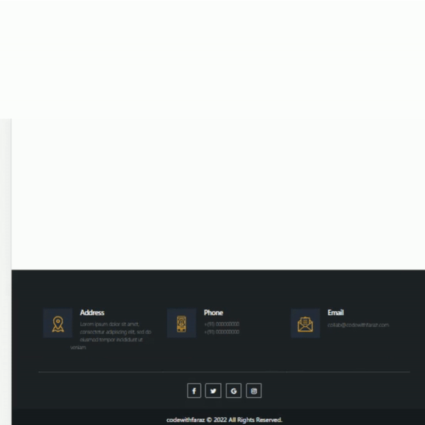
Contact Information
Contact information should be clear, concise, and easy to find. Include an address, phone number, and email for direct communication. Add a live chat option or contact form if you can manage it.
J.Crew sets a good example by including their customer service Twitter along with other details in their footer.
Social media links are essential too. Make it simple for users to visit your Facebook or Twitter account directly from the footer. Highlighting availability hours or location status adds value; Alex Lakas does this brilliantly on his site’s footer design.
Avoid redundancy like Netflix’s repeated contact links—less is more here!
Legal Disclosures and Privacy Links
Legal disclosures and privacy links play a key role in building trust. These links, often found in the footer, help users understand their rights. Companies like Coca-Cola keep them simple by listing legal terms neatly in one column.
Hulu makes it clear with a mix of social and legal links that are easy to spot.
GDPR and CCPA compliance require websites to include privacy policies. Dropbox sets a good example by highlighting essential documentation for transparency. Copyright notices also appear here, stating content ownership clearly—this avoids confusion with users or search engines.
Adding these elements ensures your website stays transparent while following global laws on user data protection.
Call-to-Action (CTA) Buttons
A good footer needs one clear call-to-action button. It grabs attention and encourages a final click. Booking.com uses its footer for property listings as an example of this strategy.
LEGO also spots bright CTA buttons alongside brand colours, making actions inviting and fun.
Bright colours work wonders for conversions in footers. Dizzie proves this by pairing bold CTAs with clean spacing and certifications, ensuring no clutter distracts users. The National Park Foundation includes a newsletter signup form in the footer, drawing subscribers late in their scroll journey.
A sticky Spotify “Play” button is another clever way to keep engaging users at every turn. Simple designs paired with thoughtful placements make all the difference!
Social Media Links
Social media icons can turn your footer into a gateway for engagement. Take inspiration from H&M, which uses left-aligned, recognisable icons paired with mobile-friendly accordions.
Active accounts? Embed feeds like Instagram widgets as TheGoodTrade.com does. Inactive accounts? Use direct links instead to avoid empty impressions. WHO combines these with navigation columns seamlessly while boosting user trust through accessibility.
Enhancing User Engagement with Footer Design
Your footer can do more than sit quietly at the bottom. With clever tweaks, it becomes a magnet for clicks and connections.
Add Newsletter Signup Forms
Place a newsletter signup form in your footer to boost engagement. Email signups here act as magnets for returning users and build stronger connections with your audience. Blogs or content-heavy websites, like TheGoodTrade.com, often use this approach to keep their readers in the loop.
Sites like Dizzie and Figma have proven how effective these forms can be when paired with clean layouts.
Include enough white space so the form doesn’t look cramped. Adobe’s footer shows how using hierarchy enhances clarity while accommodating such features. An appealing call-to-action (CTA) button helps too, nudging visitors to subscribe without second-guessing.
Adding this simple touch turns casual browsers into loyal subscribers straight into your inbox!
Display Testimonials or Awards
Showcasing awards or testimonials in the footer builds trust. A few well-placed badges, like Reykjavik Excursions’ use of awards, reassure visitors. Too many can feel overwhelming though, creating a sense of instability.
Dizzie highlights certifications smartly to boost credibility without clutter.
Widgets from TrustPilot or Google Business provide authentic social proof. H&M’s use of icons and AliExpress’ organised layout shows how structured footers create confidence. Use A/B testing to decide how many elements work best for your design and audience flow.
Highlight affiliate logos next for added partnerships appeal!
Highlight Affiliate or Partner Logos
Partner logos in your footer build trust with visitors. They show connections and credibility. For example, Booking.com uses group brand logos to highlight partnerships, boosting user confidence.
Coca-Cola smartly organises legal and partner links in its footer, creating a seamless design.
Large firms like Walmart list subsidiaries such as Hayneedle or Jet in their footers for better brand awareness. Adding well-known affiliate logos strengthens recognition and adds legitimacy, even for smaller businesses.
Lego’s colourful footer shows how creative designs can extend to partner brands too! Keep it clean yet impactful; clutter will only confuse users on mobile devices or desktops alike.
Best Practices for Footer Optimisation
Make your footer a strong building block for user experience, guiding visitors effortlessly with clear and smart design choices.
Prioritise Relevant Links
Focus on links aligned with user or business goals. Include only essential pages, avoiding unnecessary clutter. For example, Apple focuses on important groupings for clarity. Figma stands out by providing support and key documentation prominently.
Keep footer menus concise, listing fewer than 25 pages for better organisation.
Arrange links logically to appeal to primary audiences. Dwell Magazine’s footer directs media experts or investors with specific options. Group logos like Booking.com make access to related services straightforward as well.
Emphasise top searches without overloading users; simplicity makes a significant impact!
Use Visual Hierarchy for Clarity
Place the most important links at the top or give them bold fonts. Use size, colour, and weight to guide readers’ eyes. For example, BBC highlights essential navigation with clear sections for news topics and language options.
ASOS uses simple layouts with payment icons and delivery policies placed strategically.
Add whitespace around key elements like Adobe does. It makes scanning easier and reduces clutter. Tailwind CSS separates content using a horizontal rule, organising details neatly.
Group similar items under bold headings to mirror WHO’s footer design style. Clear hierarchy boosts visibility while improving search engine optimisation naturally!
Group Similar Content Effectively
Logical grouping makes a footer easier to scan. For example, ASOS organises content like social media buttons, payment options, and policies into separate sections. H&M uses accordion menus to group links neatly, improving clarity.
This approach helps users find what they need quickly.
Keep related information together using navigation columns or clear labels, as seen on the BBC footer. AliExpress simplifies its chaotic interface by aligning grouped content with good contrast and spacing.
Zorro Design Agency focuses on coherence by arranging brand elements alongside vital links. Logical organisation boosts usability in web designs and ensures mobile users face less clunkiness.
Next up: Essential Elements to Include in a Footer!
Focus on Accessibility
Small details in your footer can make a huge difference for users with disabilities. Use contrasting colours for text and backgrounds to meet accessibility standards. Tools like UXPin’s colour blindness simulator help fine-tune this.
Avoid decorative typefaces; stick to clean sans serifs for better clarity, especially on mobile devices.
Font size matters too. Keep it at least 16px on mobiles so people do not struggle while reading. Make sure footers work seamlessly even on pages with infinite scrolls or heavy content, like a PDF reader download page or YouTube-style layout.
Good spacing, as seen in Hulu’s footer design, enhances usability but don’t forget clear CTAs! These small adjustments improve experiences and boost engagement across all platforms dramatically!
Common Mistakes to Avoid
Cluttering your footer is like overpacking a suitcase—it makes everything harder to find. Poor design choices can confuse users or push them away, so tread lightly!
Overloading with Links or Text
Packing a footer with too many links or text confuses users. CNN’s footer, for example, has both top-level and lower-level categories but shows the risk of cluttered design. A site-map style should stick to 25 pages or fewer.
Netflix’s random link arrangement highlights this issue even more, making navigation messy.
Long paragraphs crammed in footers also harm readability. Users skim footers quickly; don’t force them to dig through layers of hierarchy just to find basic legal disclosures or privacy links like cookies.
Follow examples like Clarity Money or Figma by keeping only essential content visible while avoiding unnecessary distractions from social media badges and testimonials overloads.
Ignoring Mobile Compatibility
Cramming links clutters the footer, but ignoring mobile compatibility can be worse. Mobile users expect smooth browsing. A cluttered or unreadable footer pushes them away fast.
Footers must stack content vertically on small screens. Use accordions to hide extra text while keeping it accessible for those who need it. Hulu and H&M use spacing, icons, and smart design tricks that work well on phones.
Test your site on various devices regularly; this avoids frustrated visitors leaving at record speeds!
Using Poor Contrast or Colours
Poor contrast makes text hard to read. Pairing light grey fonts with white backgrounds, like Zara’s footer, reduces visibility and frustrates users. Bad colour choices can also confuse visitors.
For instance, unrecognisable social media icons or overly decorative typefaces drive people away.
Strong contrast improves readability and guides attention effectively. Hulu’s footer gets it right by using clear links with proper spacing. Tools like UXPin’s contrast checker help test your palette for accessibility issues.
Tailwind CSS shows how logical grouping and good hierarchy create a better experience too.
Conclusion
A well-crafted footer ties your website together. It’s like the final chapter in a book, leaving users with clear paths and useful details. Focus on clarity, simplicity, and purpose.
Add value through links, contact info, and CTAs without overloading it. A smart footer enhances UX and keeps visitors engaged until their very last scroll!
FAQs
1. Why is the website footer important for user experience?
The footer acts as a guidepost, offering essential information and links that users might need when navigating your site. It’s like the building blocks of usability, ensuring visitors can find key details such as contact info or social media links like X (formerly Twitter).
2. What should I include in my website footer?
Your footer should have clear navigation links, a strong call to action, and helpful resources like privacy policies or terms of use. You can also add elements related to search engine optimisation, such as keyword-rich descriptions or internal links.
3. How does typography affect the design of a website footer?
Good typography improves readability and makes your content visually appealing. Focus on kerning and font size so text looks clean and professional while staying easy to read across devices.
4. Can wireframes help in designing an effective footer?
Yes! Wireframes act as blueprints during website design, helping you plan how elements fit together below the fold without cluttering space above it. They save time by giving clarity before diving into tools like Photoshop for final touches!
